The Power of Color in Design
 When it comes to design, color has power. Everything from how your brand is perceived by potential clients to how well your brand stands out amongst competitors is influenced by the colors you choose. So how can you harness the power of color?
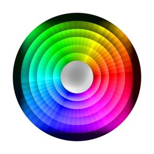
First, you need to be aware of what cues colors send. Red, for example, imparts passion and excitement. Yellow sends a message of happiness. Orange screams “high energy”. Greens and blues signal tranquility. Purple is traditionally equated with royalty. Brown is associated with nature. Pink is seen as feminine and romantic. Black ranges from sophisticated and luxurious to sorrowful. White is the symbol of purity.
Once you’ve considered the colors’ meanings, think about what you want your brand and marketing materials to convey. Studies have shown that color can increase brand recognition by up to 80% and that many first impressions about a brand or a product are formed solely on color. So choosing appropriate colors can be just as important, if not more important, than the words you use. If you’re promoting a high-energy dance club, a tranquil blue is probably not going to attract the right crowd. Conversely, if you own a yoga studio that specializes in restorative classes, reds and oranges won’t send that message effectively.
At Asterisk Creative, branding is a specialty of ours. Between our branding team, our design team, and our website developers, we are well-versed in using color to appropriately convey your brand’s messaging and values. We know how to take a competitive analysis and also use color to help you stand out in your crowd.
When you’re ready to harness the power of color, give us a shout and let us help take your brand and your company to the next level!