What Does it Mean to be a Marketing and Communications Agency?

What Does it Mean to be a Marketing and Communications Agency?At Asterisk Creative, we pride ourselves on being an award-winning marketing and communications agency. But what exactly does that mean?

Bascially, a marketing and communications agency takes a full-service approach. We understand that no matter the set up, marketing must work with public relations which must work with digital and so on and so forth. It’s best for all involved when all of those entities can be under one roof.

At Asterisk Creative, we have teams that are segmented by specialty. However, we all work together to offer you a holistic approach. Whether you’re in need of branding, public relations, SEO, social media management, marketing materials, web design and development, or some combination thereof, our teams work together to make sure your messaging is cohesive and your overall goals are met. All of your campaigns are multi-faceted, and all facets are designed to work together. Your marketing communications are custom-designed to speak to your company and each of its target audiences. What you get in return is a higher lead generation count which ups your potential to increase sales. This is exactly what you should expect from a marketing and communications agency worth its salt.

If this sounds like the type of help you need – or that you’ll be looking for in the new year – give us a shout. We’d love to add you to our client roster and get your business going gangbusters!

Web Design for Lead Generation

Web Design for Lead Generation | Website Tips | Asterisk CreativeAs a tool in your marketing arsenal, your website should also bring you leads and customers. But a lot of websites fail in this respect. Here are a few tips on web design for lead generation from the team at Asterisk Creative.

  1. Focus on your customer, not yourself.
    As a business owner, it’s often second nature to want to tout how great your products/services are, how knowledgeable your team is, etc. For the most part, though, this doesn’t help people. They want to know how you can help them, how your products and services will make their lives easier. Instead of writing your on-page copy to scream the greatness of your company, talk instead about the problems you solve for those that buy from you.
  2. Give visitors a reason to trust you.
    Telling visitors to your website how you can help is one thing. Showing them how you’ve helped others or have the accreditation to help them speaks volumes. Have you won an award for your work? Put a picture of it on your site. Do you belong to professional organizations? Their logos need to be on your site, too. Have client testimonials about how great your work is and what you did for them? Yep – you’re missing out if those aren’t on your site.
  3. Double-check the mobile version of your site.
    Everyone’s on mobile now. If your site doesn’t render well on a mobile device, you’ve just removed yourself from consideration as a vendor for their purchase.
  4. Make sure your site’s user experience leads them to contact you/buy from you.
    Let’s face it. The more technology makes things easy for us, the lazier people become. Once a visitor is on your site, they don’t want to have to look for what they originally came to the site for. As you’re laying out your site, ask yourself these questions:
  • If someone lands on your home page, how many clicks does it take to complete a purchase or find pertinent information? (The more clicks, the more likely you are to lose them.)
  • Is your contact information easily findable on every page, giving an easy way to reach out instead of just leaving your site, and business, altogether?
  • How long does it take for the site to load? (Even a 0.1 second increase in load time can affect whether people stay.)
  • How content-heavy is your site? How distracting are your graphics? (You need a balance of content and graphics.)

Is your website falling short? Bring your website to the top of its game. Get on board with the team at Asterisk Creative to make sure your website is doing all it can for your business.

Digital Wellbeing for Business Owners

Digital Wellbeing for Business Owners | Asterisk CreativeOn the Google blog, they recently released a post called “Find a better balance with our tips for Digital Wellbeing”. The premise of the article is that, even as technology is making things easier for people, it’s also adding stuff to their plates; Google has put together a course on how to handle the extra stress and take care of ourselves in the midst of all this.

Day after day, we hear these same things from our clients and potential clients. Technology is making the life of a business owner easier in many respects. Social media and company websites allow affordable solutions to getting a business’ message out there. But by the same token, they’re adding items to the to do lists. Remembering to post on each outlet. Keeping up with algorithm changes to keep the website ranked. The new to dos go on and on. So here are a few of our tips for digital wellbeing for business owners.

  • Hire help.
    Yes, this seems like the natural one for us to suggest first. But it’s also the easiest for you. No one person can keep up with SEO algorithms and best practices for the three major search engines, the algorithms and best practices for the ever-growing number of social media outlets, best practices in website design, maintaining relationships with the proper media folks to implement great public relations strategies, etc. That’s why at Asterisk Creative, we’ve built teams of experienced practitioners to tackle all of these items. One person isn’t in charge of all of them. But we work together to put all of our skills to use for you in the best way possible while staying within your budget.
  • Focus, Focus, Focus.
    Whether you’re hiring help or taking on your company’s digital life on your own, our advice is the same: narrow your focus to just the items you NEED. No company needs to be on every social media outlet that exists. They’re all just not a good fit. Not every company needs an 800-page website. Focus your site’s pages to just the information you need the search engines to find (while working with what their algorithms are looking for, naturally).
  • Take a break.
    Put the smartphone down. Walk away from the computer. Even if it’s just for a 10-minute walk at a time, a few times a day, get away. Your brain will thank you. Your eyes will thank you. And your wellbeing will thank you.

When you’re ready for Asterisk Creative to help with your digital wellbeing, give us a shout! We’re here and ready to give you a hand.


2019 Website Design Needs

2019 Website Design Needs | Asterisk Creative | Website Design AgencyWebsite design trends don’t just change year to year. A website that looks great today can look dated in a matter of mere months. What’s worse, website designs that don’t keep up with the search engines’ algorithm changes can suffer. So what are some of the website design needs you need to be looking at as we move into 2019?

  • Speed.
    This one will affect you two-fold. First, studies have shown that when people visit your site, you have three seconds to make a good impression with them and for them to find what they’re looking for. If your site is so data-laden that they don’t see what they want in that time, they’ll bounce from the site. So not only have you lost this potential client, the search engines “punish” sites with high bounce rates by lowering their organic rankings. Second, a recent Google algorithm update placed importance on load speed. If your site doesn’t load quickly – whether it’s because of your server, the size of your photos, or any other reason – your site will be “punished” with lower organic rankings anyway.
  • Mobile-First Design.
    Another Google algorithm change in 2018 moved toward focusing on a how a site renders on mobile devices. This was a response to the ever-increasing number of mobile searches. Even if your site looks amazing on a desktop or laptop computer, if it doesn’t look equally amazing and load equally fast (if not faster) on mobile devices like smartphones or tablets, the search engines will not rank your site as high. Needless to say, this affects the number of searchers than may find your site and become a lead or customer.
  • Attention-Grabbing Graphics.
    Again, this goes back to making a good impression within that first three seconds. Contrasting colors, asymmetrical design, and the use of shapes and crisp edges get a visitor’s attention quickly without adding the load time of photos or putting the work of sorting through lots of words and data on the site visitor.

At Asterisk Creative, our website design team is well-versed in how trends are changing and how to make them work for you. If your site is in need of anything from a touch up to keep up or an entire overhaul, we can help. Give us a shout today!

Does Your Website Design Make Your Company Seem Trustworthy?

Does Your Website Design Make Your Company Seem Trustworthy? | Asterisk CreativeMany studies have been done over the years on what makes folks want to complete a purchase with a company. Time after time, the results have shown that people buy from companies they feel are trustworthy. And as it turns out, a company’s website design plays a role in determining that trustworthiness. So what elements should be a part of your website to help build that feeling?

  • Your website design should be straightforward and easy to navigate. The easier it is to find information, the less it seems like there are things you’re trying to hide.
  • Include testimonials. Seeing that other current customers have had positive experiences gives credence to the feeling that this visitor will have a positive experience, too.
  • Feature clear calls to action. Visitors often don’t know the next step unless you explicitly tell them. Make it easy by showing them clearly and appropriately how to buy your product straight from the site or how to contact you. Additionally, lots of visitors won’t read your content or will only skim your copy. Prominently show your contact information in the header of all pages of your site. It needs to be one of the first thing seen on each page.
  • Make sure third-party endorsements are prominently featured as well. If you’re certified by the Better Business Bureau, they offer a logo for websites to show this. Logos for industry certifications and awards can also impart that you’re trusted by those in the know in your industry. In turn, this can build a sense of trustworthiness to your site visitors, too.
  • If possible, include a live chat feature. Consumers want instant gratification but also a connection with those they choose to do business with. While social media outlets can help with this, particularly if you have someone responding to tweets and comments in a timely manner, incorporating a similar experience from your website can influence purchases without sending potential customers to yet another online spot.

If you’re ready to take your website to the next level, contact Asterisk Creative today! We are here to work with your budget and your goals to get a fantastic website designed for you.

What Does Mobile Search Mean for Website Design?

Website Design for Mobile Searches | Asterisk Creative | Southeast's Premier Website Design AgencyBack in the day (like, 7 years ago or so), websites showed on computers and phones were just…phones. With the advent of internet-enabled phones and then smartphones, all of that started to change. Websites didn’t render properly on these smaller devices, so changes had to be made. So what does the rise in mobile searches mean for website design?
The initial reaction by website designers was to create, in essence, two sites – one that would load when a search came from a laptop or desktop computer, one that would load when the search came from a mobile device. This is still a recognized practice, though it’s fallen a bit out of favor. The search engines tend to see the sites as two separate sites, one with duplicate content of the other, and this tends to hurt your organic rankings.

With mobiles searches increasingly on the rise, the search engines – and Google, in particular – are moving toward mobile-first indexing. This means they’re focusing more on how sites load on mobile devices than on computers. To keep up and maintain organic rankings, website designers and webmasters need to shift their focus as well. Moving to responsive web designs is a great place to start. Responsive website designs adjust automatically to fit the screen on which the searcher/visitor is viewing the site. This eliminates the problem of separate sites/duplicate content while creating a better user experience across the board.

Mobile searches are also more likely to include the phrase “near me” in the queries. Website designers and SEO practitioners alike should ensure elements like a business’ address and/or neighborhood are clearly listed in multiple places on a website to match these queries appropriately.

Website design for mobile searches is important. Make sure your website is mobile-friendly. Contact Asterisk Creative for website design help today.

Is Your Site Secure? Google to Require SSL Certificates

Is You Site Secure? Google to Require SSL Certificates | Asterisk CreativeWith all of the security breaches and data breaches in the news lately, it should come as no surprise that Google is making moves to make the internet a safer place. In one such move, Google is going to require SSL certificates for all sites soon.

First things first. What is an SSL certificate? SSL stands for secure sockets layer. The certificate being on the site creates an encrypted link between the server and the browser so that all data remains private. In effect, this technology protects site visitors from cybercriminals.

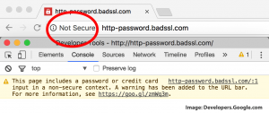
After Google implements this SSL requirement, sites without an SSL certificate will be flagged as “not secure”, alerting searchers that visiting that site may put their data at risk. Obviously, this will be a deterrent for potential site visitors, and your website’s traffic will invariably suffer. In addition, sites without SSL certificates will be “dinged” in the organic search results, no matter what other SEO (search engine optimization) work has been done on the site.

This move had been slated to take effect in July, but Google has pushed the deadline back to September for now. This may change again – to be pushed back to later than September or moved up to sooner. Get your site set now. Contact Asterisk Creative for your next steps today!

Asterisk Creative – Your Digital Marketing One-Stop Shop

digital marketing agency | asterisk creativeThere are a lot of components to digital marketing. In general, it is comprised of website design and development, SEO, social media marketing, and pay-per-click advertising. Basically, it’s any marketing and advertising that appears online.

Many freelancers and solopreneurs fancy themselves digital marketers, jacks-of-all-trades so to speak. We’re here to tell you that that’s nearly impossible. Keeping up with algorithm changes, privacy laws, best practices, and such across one or two digital marketing platforms can be a full-time job in and of itself. One person may be able to do well across the board, but they cannot really excel.

At Asterisk Creative, we understand this and have a team behind your digital marketing. We have folks that focus solely on social media, solely on website design, solely on SEO – and each knows their specialty inside and out. They work and train to stay on top of the latest and greatest in their field, and they put that knowledge to work for our clients. Additionally, they work together to make sure all of the client’s digital marketing elements are working together favorably and promoting the brand appropriately.

Don’t trust your digital marketing to just anyone. To get your digital marketing going full speed, contact Asterisk Creative today.

2018 Web Design Trends

2018 Web Design Trends | Asterisk Creative | Southeast's Premier Web Design AgencyAs much as business owners want their website designs to be one and done (meaning you get your site designed once, then you’re good to go forever), that’s really not the case. The way folks consume data online changes almost daily. An older website design will look stale and will not convert visitors into leads or, better yet, customers.

How do you combat that? Stay on top of web design trends and make sure your website’s look and feel match what experts say converts visitors into clients. For 2018, here are a few of the trends we have our eyes on:

  • Vibrant colors.
    Muted colors that were popular in the past are just that – popular in the past. Bright, engaging colors are the new way to go.
  • Bespoke visuals.
    Stock photography is also on its way out for 2018. Images created specifically for your brand – whether through photography or through design software – are in.
  • Responsive design.
    This one isn’t just a trend to keep site visitors engaged. This one can have a huge effect on your SEO and whether or not the search engines show your site in the search results! Having a website that renders well on a variety of devices (like phones, tablets, laptops and desktop computers) is essential now, particularly since mobile searches have overtaken desktop searches in nearly every industry
  • Innovative Typography.
    The use of different fonts to create an eye-catching site is catching on! Custom fonts are being designed every day, and when paired with the vibrant color trend, your copy can draw visitors in like no other.

Don’t let your website’s visitors walk away from you because your website doesn’t speak to them. Get ready to get your website redesign underway. Contact Asterisk Creative today.

Graphic Design Best Practices

graphic design best practices | graphic design agency | web design agency | asterisk creativeWhether you’re talking about a website layout or printed marketing pieces, good design is essential. Knowing and following graphic design best practices is a great place to start.

One of the most basic graphic design best practices, and one that’s stood the test of time, is KISS – Keep It Simple, Stupid. Simply stated: don’t overcrowd your piece, don’t use a convoluted collection of colors and fonts, and don’t forget that white space is your friend. A simple design communicates your message much more effectively.

Another basic best practice in graphic design is understanding the messages your color choices send. Warm colors bring feelings of passion; cool colors have a calming effect. If you reference a color wheel, colors side-by-side are analogous and communicate unity and balance. Colors across from each other are complementary; using complementary colors brings a bit more higher emotion to your design.

Lastly, humans tend to read designs (both web and print) from top left to bottom right, generally speaking. A good design will make this flow easy for the viewer and not block that flow at any point.

Let your marketing pieces speak volumes for you. Contact Asterisk Creative for amazing design work today.